Like many fantasy board game systems, the life of Descent Second Edition was greatly extended with the sequential release of expansion materials that built upon the components of the Core Box. Material from the First Edition was revamped and re-released in the form of Hero and Monster Collections, such as Oath of the Outcast. Entirely new material would be released in the form of “Small Box” and “Large Box” expansions, both of which featured an assortment of new characters, classes, enemies, status conditions, campaigns, and equipment. Small Boxes contained two new Heroes (each with a new class), two new Monster types, and a mini-campaign focused on a single Lieutenant (whose figure was released separately). Large Boxes would contain four Heroes (each with a new class), four new Monster types, and a full campaign with several new Lieutenants (again, miniatures released separately).
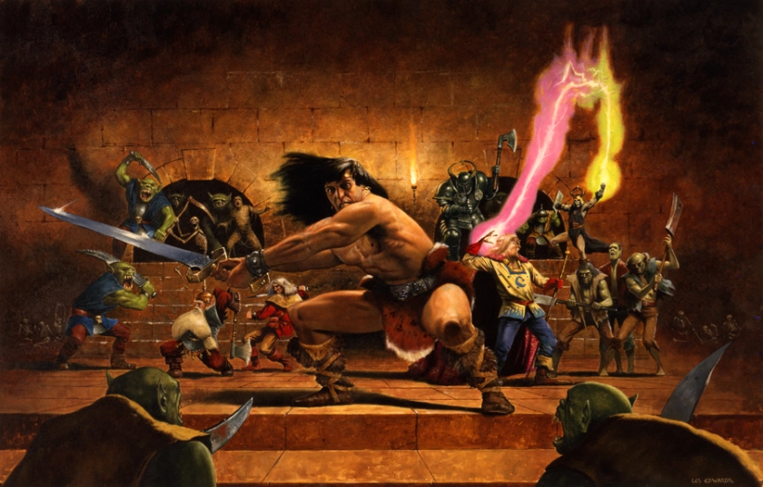
The first of the small box expansions was Lair of the Wyrm, which pitted Reynhart the Worthy and High Mage Quellen against the evil dragon Valyndra and her fire-themed minions.
The treacherous Wyrm Queen Valyndra has awoken from her slumber, unleashing her foul hybrid minions on the countryside to burn and raid as they please. Her lust for gold has lured her from her lair, and now it’s up to a few brave heroes to drive her back into hiding and destroy her cruel servants!
I imagine that one of the biggest challenges faced by the creators of Descent 2nd Edition was to design classes with abilities that were unique and varied enough to make them distinct while keeping within the four major archetypes. The difference between a Knight and a Berserker was relatively clear, the former being more of a tank and the latter being more focused on dealing heavy damage. But how many variations on the Warrior theme could they possibly imagine? How many different ways could a Healer heal, for instance? This limitation would seem least problematic in regards to the Mage archetype. After all, there are dozens of well established magic systems within the fantasy genre from which they could draw inspiration. The base game had the Runemaster (who benefited from Rune based equipment) and the Necromancer (who summoned a melee based minion), both of which have vastly different play styles to the Lair of the Wyrm expansion’s Geomancer class.
As Quellen’s dubious title implies, he is an elf that no longer resides within the Aymhelin. The Latari don’t have such ranks within their own arcane institutions, and certainly an elf as young as Quellen would not have risen so high before even reaching his one hundredth year of service to Lord Aenoeth. Quellen’s mysterious link to the natural world drove him to explore the outside world, far away from what he would soon learn is referred to as the “Green Gate.” Unlike many Latari, Quellen got on well with the other races inhabiting Terrinoth. He enjoyed the naïvety of humans, the craftsmanship of dwarves, the traditions of the orcs, and even the eccentricities of the gnomes. For that reason, Quellen devotes his unique powers to protecting those that gave him his title.
As the name would imply, a Geomancer’s abilities are focused on manipulating the ground itself through the creation of Summoned Stones. These moveable objects can be strategically placed to hinder enemy movement and block line of sight, or they can be used offensively as the target of AOE attacks (hitting enemies adjacent to the Stone) or channeling the Geomancer’s attacks through the space containing the Stone (effectively extending range and line of site). The use of these powers does require a significant amount of stamina, however, which is one of the reasons that High Mage Quellen makes such an excellent Geomancer. Both his Heroic Ability and his Heroic Feat regenerate fatigue, allowing him to continually exploit his innate connection with Terrinoth’s natural energies.
“I feed off the wisdom of others, even when it’s less filling than my own.“
The miniature for High Mage Queen was about average for the earlier Descent 2nd Edition releases. There is a lot of detail packed into a very small miniature, which is both a blessing and a curse. The sculpt is certainly not lacking in interest, but some of the details are just too fiddly to be well defined. The shoulder pad and ear on his left side are particularly lacking. But other features (such as his hands and flowing robes) are rather well executed and create a very dynamic miniature. As always, I attempted to stay as close to the reference art’s color palette as possible.
Overall, I think this mini looks great. I really didn’t think much of it when I first started the project, but as the different materials were added, the piece really came together. In retrospect, I would rate this miniature as the most satisfying model out of the first two boxes, although Shiver may still edge him out for best hero that I have finished to date. Can’t wait to get to some of the more recent releases though! Unfortunately, Shadow of Nerekhall continues to loom over me as well. But, with Lair of the Wyrm now officially complete, the Crown of Destiny Hero and Monster Collection is next on the docket.
Red Fabric: The red skirts and trim were base coated with VMC German Camo Black Brown (70.822). The individual forms were picked out with VMC Cavalry Brown (70.982), then blended back into the base tone with mixes of the two colors. Highlights were then added to the most prominent areas with VMC German Red Brown Surface Primer (70.605), followed by point highlights of German Red Brown mixed 1:1 with VMG Medium Grey (70.987).
Green Robes: The areas of green cloth were base coated with a 1:1 mix of VMC German Camo Black Brown (70.822) and VMC Uniform Green (70.922). The major forms were picked out with pure Uniform Green, then blended back into the shadows with incremental mixes of the two colors. Highlights were applied with a 1:1 mix of Uniform Green and VMC Ice Yellow (70.858).
Gold Trim: These areas were painted with a standard non-metallic metal approach using the following colors: VMC German Camo Black Brown (70.822), VGC Heavy Brown (72.153), VGC Heavy Goldbrown (72.151), and VMC Ice Yellow (70.858).
Leather: The belts and tassets were base coated with VMC German Camo Black Brown (70.822). A base layer was then applied with a 1:1:1 mix of Chocolate Brown (70.872), VMC German Red Brown Surface Primer (70.605), and VMC Orange Brown (70.981). The major forms were picked out with the addition of more Orange Brown, followed by pure Orange Brown. Highlights were applied with a 1:1 mix of Orange Brown and VMC Dark Sand (70.847).
White Cloth: These areas were base coated with VMC Neutral Grey (70.992). The major forms were picked out with a 1:1 mix of Neutral Grey and VMC Ivory (70.918), followed by a 1:2 mix of the same colors. Highlights were applied with pure Ivory.
Skin: The areas of flesh were base coated with a 1:1 mix of VMC German Camo Black Brown (70.822) and VNFP Base Flesh (74.004). Major forms were picked out with pure Base Flesh, followed by a 1:1 mid of Base Flesh and VNFP Medium Flesh (74.005), and lightened with the addition of an equal measure of VNFP Fairy Flesh (74.007). Highlights were added with pure Fairy Flesh.
Hair: The blonde hair was base coated with VMC Chocolate Brown (70.872). Major forms were blocked in with a 1:1 mix of Chocolate Brown and VMC Japanese Uniform WWII (70.923). Individual strands were picked out with pure Japanese Uniform, then highlighted with a 1:1 mix of Japanese Uniform and VGC Bonewhite (72.034), with final point highlights of pure Bonewhite applied sparingly.
While I love painting gaming miniatures, there is no shortage of non-gaming artistic miniatures and busts that interest me as well. About once a year, I treat myself to undertaking one of these larger, but more meaningful subjects. As 2023 drew to a close, I decided to put my other projects on hold and take a month or two to concentrate on one model that has been on my mind for a long time: Raziel from the Legacy of Kain/Soul Reaver video game series.
For those who are unfamiliar with this franchise, it is named for the vampiric warlord Kain and his centuries-long efforts to restore balance to the land of Nosgoth. This “balance” represented a harmony between the different magical elements of the land, each of which was focused into a physical Pillar and protected by a Guardian. In the first game of the series, Blood Omen, Kain is transformed from a young nobleman into a fledgling vampire, and is quickly wrapped up in the political and spiritual machinations of the Guardians of the Pillars. Through their use and manipulation, Kain unwittingly changes the course of history and dooms not only the physical Pillars of Nosgoth, but the order and prosperity that they generate. Along the way, he discovers the powerful Soul Reaver sword, a blade possessed by a ravenous spirit that consumes the souls of those it kills.
The second game, Soul Reaver, begins hundreds of years into Kain’s reign over the decaying kingdom. Raziel, one of Kain’s lieutenants is sentenced to an eternity of pain and torture for having developed wings, essentially surpassing his master’s evolutionary progress. Begin awoken by a spectral god of the underworld, Raziel is tasked with overthrowing Kain and restoring a form of balance to the world. Disfigured and effectively “zombified” by his punishment, Raziel now straddles the line between the physical realm and the spectral realm (underworld), feeding on souls rather than blood to sustain his form. Early in the game, Kain strikes Raziel with the Soul Reaver, with the sword shattering to the surprise of all. The spirit inhabiting the Reaver binds itself to Raziel, producing a “wraith blade” with the same soul-devouring qualities of the original sword. Armed with this new weapon, Raziel hunts down his former brethren and pursues Kain, only to find that he is also playing a role in the manipulations of higher powers, and not all is as it seems.
This series of games occupies a very sentimental place in my heart. Not only was it one of the first games I played on the Sony Playstation, but the intricate story and political twists and turns were fascinating and enthralling to my young mind. But even more importantly, the gothic atmosphere and visual design of the environments and characters were truly inspiring. Raziel in particular was glorious: exposed muscles and tattered wings that made him seem continuously tortured, the missing lower jaw and gaping throat through which he consumed the souls of his foes, and the use of his cowl to conceal his disfigurement. He is at once noble and powerful, and yet also horrific and pitiful.
The decision to paint this iconic character was solidified (literally) when I stumbled upon a digital sculpture that perfectly captured everything I loved about this character. It was part of a monthly release from the Prey stl Collection Patreon, and came in various sizes. Poised upon one of the ruined Pillars of Nosgoth, Raziel is depicted in a dynamic pose that perfectly captures his agility and posture. The way his wings flare out behind him, the angle of his gaze, the way the Soul Reaver is held ready to strike… it was all perfect. So, having acquired a 12k printer which was capable of the level of detail I desired, I printed him off in 75mm scale, and began to paint.
Everything went relatively smoothly, but there were some minor hiccups that I encountered. First of all, there was the issue of color palette. In the games, Raziel is able to travel between the physical realm and the spectral realm, the latter of which is depicted with a heavy greenish cast to all lighting effects. I chose to paint the figure as though he were in the physical realm, because I find the spectral realm a bit monotone and less interesting overall. This led to a second issue, however, as Raziel’s coloration and level of detail vary greatly across the three Soul Reaver titles. The original game was released for the Playstation, while Soul Reaver 2 and Defiance were released on the Playstation 2. The later titles had much crisper visuals and more intense coloration than the original.
The tone of Raziel’s blue flesh was different in all incarnations as well as in the rendered production art I was able to find. Given this broad range of options, I chose a tone that seemed in keeping with my memory, although it could be considered completely inaccurate depending on with which source it is compared.
As I began painting, other problems began to arise. While the sculpt itself looks amazing, I came to find many inaccuracies and imperfections as I progressed. The musculature of his legs is not anatomically consistent, forcing me to “wing it” in regards to identifying what tissue corresponded to certain features. The game model for Raziel wears a greave on both legs, but the sculpt depicts a cloth wrap on the left leg instead. Similarly, the wraps around his forearms are a single layer on the sculpt, while the game assets have a longer white layer that extends onto the upper arm. And lastly, although the folds in his cowl add to the realism and sense of motion that drew me to this model, this was much simplified in the game art. These folds made it impossible to cleanly render the white glyphs (the symbol of Raziel’s clan) that are integral aspects of his overall appearance, somewhat diminishing the “likeness” that I was able to achieve.
Still, in the end, this turned out to be one of my most satisfying projects to date. I also ended up designing and printing a simple plinth on which to display the finished piece. I am very pleased with the end result, and plan to enter this into a painting contest at some point down the road. While I had hoped to create more dynamic lighting and some OSL effects, this is still my best work. My only real regret is that it took me several months to finish (lots of family events and other commitments made painting time scarce). Definitely looking forward to tackling more subjects like this in the future, although I plan on returning to smaller pieces for the foreseeable future.
“Flesh”: The areas of exposed muscle and ligaments were all base coated with VPA Periscopes (70.309). Shade was applied in the deepest recesses and downturned areas with a 1:1 mix of Periscopes and VMA Armor Brown (71.041). The major forms were then picked out with a 1:1 mix of Periscopes and VMC Medium Blue (70.963), which served as a base tone for these portions. This was lightened with the addition of VMC Ice Yellow (70.858) in multiple stages, followed by the addition of VMC Ivory (70.918). Areas of extreme highlight and ligamentous focus were painted with VMC Pale Blue (70.906) and Ivory.
The general process for the muscle effect was to sketch the shadows and highlights for each area, but stopping tone short of the brightest or darkest tone intended. Then the fibers were laid down with a slightly brighter tone, then highlighted more intensely than the areas surrounding them. Shade was added to the lower portion of each striation, then everything was blended to completion.
Cloak and Wraps: The entire area was blocked in with VMC German Camo Black Brown (70.822). A base tone was created with VMC Leather Brown (70.871) and VGC Parasite Brown (72.042) mixed 1:1. A shade tone was created with the addition of German Camo Black Brown, and several highlight tones were created with the addition of incremental portions of VMC Ice Yellow (70.858) and additional Parasite Brown.
Leg Armor: The leg armor was painted using a standard non-metallic metal application of using the same base tone used for the cloak and wraps, but substituting VMC Green Grey (70.971) for the highlight tones.
Hair: The hair was base coated with VMC Black (70.950) and highlighted with grey tones created from Black and VMC Pale Grey Blue (70.907).
Claws: The claws were base coated with a 1:1 mix of VMC Leather Brown (70.871) and VPA Highlight Africa. Tank Crew (70.340). The major forms were lightened with additional Highlight Afrika Tank Crew, then highlighted with the addition of VMC Green Grey (70.971).
The Reaver: The spectral energy was base coated with Schmincke Titanium White. This was then layered with mixes of Titanium White, VGC Electric Blue (72.023) and VGC Magic Blue (72.021) to create a bit of a flame effect.
Base: Soil: The entire area of soil was base coated with VMC US Olive Drab (70.887). Multiple layers were applied with mixes of US Olive Drab and VMC German Camo Beige WWII (70.821) to the upper edges, working up to pure German Camo Beige WWII for the highlights. Point highlights were applied to the sharpest edges with a 1:1 mid of German Camo Beige WWII and VMC Green Grey (70.971). Shade was applied to the deepest shadows with a 1:1 mix of US Olive Drab and VMA Armor Brown (71.041).
Bones: The bones were base coated with a 2:2:1 mix of VMC Green Grey (70.971), VMC German Camo Beige WWII (70.821), and VMC. US Olive Drab (70.887). This was blended into the base with the addition of more German Camo Beige WWII and US Olive Drab (the midtown of the soil mix above), and highlighted with the addition of more Green Grey.
Pillar: Stone: The stone of the pillar was base coated with a 1:1 mix of VMC London Grey (70.836) and VMC Green Brown (70.879). A shade tone was created with the addition of VMC Black (70.950), and highlight tones were created with teh addition of VMC Sand (Ivory) (71.075).
Green Stone: The green area of stone was base coated with a complex mixture of the base mix of the pillar (VMC London Grey (70.836) and VMC Green Brown (70.879)), VMC Green Sky (70.974), and a touch of VMC Park Green Flat (70.969). This was darkened with VMC Black (70.950) for shade tones, and lightened with VMC Pastel Green (70.885) for highlight tones.
Metal: The metal trim was base coated with VMC German Camo Black Brown (70.822). A standard non-metallic metal approach was then used with the following colors: German Camo Black Brown, VGC Heavy Sienna (72.154), VMC Japanese Uniform WWII (70.923), and VMA Sand (Ivory) (71.075).
One way that a board game can generate a bit of variety and interest in its enemies is to distinguish between run of the mill grunts and their leaders. Descent splits every monster group into Minions and Masters. Imperial Assault designates entire deployment groups as either Normal or Elite. Individual monsters in Gloomhaven have a similar Normal or Elite system. But these games all use the same miniature sculpt or standee to represent these enemies, requiring a different color palette or base to signify the difference. While this certainly keeps production costs down, there’s something extra special about a game that uses unique sculpts for “boss” versions of the standard monsters. And with the Against the Ogre Horde expansion, HeroQuest does pretty well in this regard.
Unofficial monster cards for the Ogre Bosses, courtesy of yeoldeinn.com
Throughout this campaign, the heroes must face the formidable Ogre Warriors (hulking brutes with very strong attack and defend stats compared to standard HeroQuest enemies). In addition, there are three unique Ogres with even more impressive attributes waiting to crush the intrepid adventurers (the Ogre Lord, Ogre Chieftain, and Ogre Champion). Although all three use the same two-part body construction as the standard Ogre Warriors, they each have a different complement of weapons and a unique head-sculpt that marks them as especially dangerous. Here is where these miniatures really shine, in my opinion. The original HeroQuest miniatures always had the perfect balance of whimsy and detail, and these Ogre Bosses are no exception. Be it the Champion’s leather hat that is pulled down over his eyes, or the popeyed squint of the Lord, these sculpts are charming and brimming with character.
Unpainted miniatures courtesy of yeoldeinn.com
They did present a bit of a problem for me in terms of color choices, however. They obviously should have fancier clothes than the boilerplate Warriors, but I didn’t want them to end up too garish or flashy. What really guided my decision, in the end, was the problem of the Chieftain’s mohawk. It is such a punk 1980’s look, and did not seem particularly in style with the rest of the game. And, being somewhat unimaginative, I could only see one inspiration for this particular design. So the Chieftain became the human version of Bebop, necessitating that the Lord become the human version of Rocksteady.
And from there, it was just a matter of buckling down and painting the minis. The bodies were a chore, as they are full of large planes that were difficult to highlight effectively (and I already painted four other copies of these parts as well). But the heads and weapons were a delight. Everything was rather straightforward with no surprises.
Overall, I’m thrilled with how these guys turned out. Vibrant colors that aren’t too gaudy, quirky expressions that read very well, and nasty looking weapons that I would hate to be struck with. A fine addition to my HeroQuest collection. On to the Wizards of Morcar, which will be the last expansion for this game. I simply cannot hope to get either of the other expansions at their price, and honestly, I don’t think those miniatures hold up to the others anyway. Until next time…
Black Pants and Belt: Base coated with VMC BLack (70.950), layers and highlights with progressive mixes of Black and VMC Green Grey (70.971).
Red Shirt: Base coated with VGC Heavy Red (72.141). Shade with 1:1 Heavy Red and VMC German Camo Black Brown (70.822). Layers with VMC Scarlet (70.817), and highlights with 1:1 Scarlet and VMC Ice Yellow (70.858).
Yellow Shirt: The entire shirt was base coated with VMC Japanese Uniform WWII (70.923). Shade was added with a 1:1 mix of Japanese Uniform WWII and VMC German Camo Medium Brown (70.826), and blended up to the base coat with a 2:1 mix of the same colors. Highlights were applied with VGC Pale Yellow (72.097), then blended down to the base with mixes of Japanese Uniform WWII and Pale Yellow.
Blue Shirt: The entire shirt was base coated with VMC Luftwafe Unif WWII (70.816), which served as the deepest shade. The major forms were then picked out with GC Steel Grey (72.102), then blended down into the shade with mixes of Luftwafe Unif WWII and Steel Grey. Highlihgts were applied with a 1:1 mix of Luftwafe Unif WWII and VGC Wolf Grey (72.047), followed by point highlights of pure Wolf Grey applied very sparingly.
Dark Skin: Base coated with VMC German Camo Black Brown (70.822). Layers with progressive mixes of German Camo Black Brown and VGC Heavy Skintone (72.140), highlights with pure Heavy Skintone.
Skin: The skin was blocked in with Vallejo Panzer Aces (VPA) Flesh Shadows (70.343). This was kept in the deepest recesses and borders, but most of the area was basecoated with a 1:1 mix of Flesh Shadows and VPA Flesh Base (70.341). Major forms were then lightened with pure Flesh Base, followed by a 1:1 mix of Flesh Base and VPA Flesh Highlights (70.342). Highlights were added with a 1:2 mix of the same colors.
Wood, Leather, Ropes, and Bags: These areas were all painted with the same four colors: VMC German Camo Black Brown (70.822), VMC Chocolate Brown (70.872), VMC Flat Earth (70.983), and VMC Dark Sand (70.847). The wood and leather leaned heavily to the darker tones while the ropes and bags leaned toward the lighter tones.
Steel: The axes, buckles, and belt studs were painted using a standard non-metallic metal approach with the following colors: VMC Black (70.950), VGC Wolf Grey (72.047), and sparing use of VMC Ivory (70.918).
Black Metal: The maul and bladed gauntlets were painted using a standard non-metallic metal approach with VMC Black (70.950) and VMC Ivory (70.918). These tones were kept far towards the darker side in order to avoid over-highlighting).
Purple Hair: The mohawk was base coated with Vallejo Fantasy Pro Imperial Purple (74.025). The individual tufts were then picked out with a 1:1 mix of Imperial Purple and VFP Blueberry (74.031), followed by pure Blueberry. Highlights were added with progressive mixes of Blueberry and VMC Ice Yellow (70.858).
Sometimes, when you combine two things, you get something much better than either of the first two things. For instance, a Reese’s Peanut Butter cup (or tree, given that it is Christmas time right now) is at least ten times better than peanut butter or chocolate alone. Owlbears are notoriously cool. And sharks with frickin’ laser beams are obviously superior to the individual components. Unfortunately, I don’t think the same pattern applies to the half-dragon Hybrid Sentinels in Descent 2nd Edition’s Lair of the Wyrm expansion.
Nobody knows exactly where they came from, but there is no doubt in anyone’s mind that hybrids are a force to be reckoned with! They walk like men, fly like dragons, and devastate anything in their path. While their sense of honor and duty may not be understood by most people, they have both in ample supply and will fight to the death to defend their kin.
Let’s face it dragons are powerful, intimidating, and exotic. Men are just… men. And this is entirely evident by the abilities of these monsters. Flying? That’s a dragon thing. Thick armor? Also more of a dragon thing. And Fire Breath? All of the interesting aspects of this enemy come from their dragon side, but they are just watered down by being half human. To make matters even worse, Descent already had a dragon hybrid in Belthir, a Lieutenant from the core box. But his is somewhat different from that of the Hybrid Sentinels, who have horns but lack a tail. They do get a +1 damage bonus to attacks targeting Heroes with Might attributes of two or less (Prey on the Weak), but this doesn’t really compensate for their other flaws. They’re not bad, per se, they just feel a little uninspired. But hey, at least they’re not more spiders…
The miniatures for this group are also rather lackluster. The swords are all bowed, the filigree is poorly defined and asymmetrical, and their faces are not well sculpted. Even more frustrating, however, is the amount of space that is difficult to reach with a knife or a brush. It is very hard to render non-metallic metal armor when there is a giant shield or wing in your way, but these obstructions are not so close that you can get away with leaving these areas in shadow. Still, they didn’t take all that long to paint, and turned out reasonably nice in the end.
I chose to paint the Minions following the color palette of the reference art.
For the Master, however, I was inspired by a texture sample I saw on Pinterest.
I really liked the contrast between the orange highlights and greenish-blue shadows. I was unsuccessful in recreating this look, but the final result was still rather striking.
I can’t really say I enjoyed the process of painting this group, but I’m happy with the end results. One more hero to go in this small box expansion, then on to another Hero and Monster collection. Stay tuned for more!
Due to an abundance of areas that were difficult to reach with a brush, the entire figure was covered with VMC German Camo Black Brown (70.822)This ensured that there would be no spots of bare plastic visible at the end.
Green Skin: The green dragon flesh was base coated with VMC Refractive Green (70.890). A shade tone was created with equal proportions of Refractive Green, VMC German Camo Black Brown (70.822), and VMC Dark Sea Blue (70.898). The major forms were lightened with a 1:1 mix of Refractive Green and VMC Golden Olive (70.857), followed by a 1:2 mix of the same colors. Highlights of pure Golden Olive were applied to the brightest areas. Some tonal variation was added with a 1:1 mix of Refractive Green and VMC Orange Brown (70.981) and lightened with a 1:2 mix of the same colors.
Steel: The steel armor was painted with a standard non-metallic metal approach using the following colors: VMC Black (70.950), VMC Medium Grey (70.987), and VMC Ivory (70.918). Tonal variation was added with the inclusion of VMC Orange Brown (70.981) to the midtones.
Red Cloak and Trim: The areas of red were base coated with a 1:1 mix of VMC German Camo Black Brown (70.822) and Vallejo Nocturna Fantasy Pro Sanctuary Red (74.020). The major forms were then picked out with a 1:2 mix of the same colors, followed by pure Sanctuary Red. Highlights were applied with a 1:1 mix of Sanctuary Red and VNFP Inferno Red (74.022), followed by point highlights of pure Inferno Red.
Orange Skin: A base coat of VMC German Red Brown Surface Primer (70.605) was applied over the German Camo Black Brown. The main forms were picked out with a 1:1 mix of German Red Brown Surface Primer and VMC Bright Orange (70.851), followed by pure Bright Orange, and then a 1:1 mix of Bright Orange and VMC Sunny Skin Tone (70.845). Point highlights of pure Sunny Skin Tone were applied sparingly. Some tonal Variation was added with a 1:1 mix of German Camo Black Brown and VGC Turquoise (Also known as Falcon Turquoise) (72.024).
Black Armor: The Master’s black armor was painted with a standard non-metallic metal approach beginning with a base coat with a 1:1 mix of VMC Black (70.950) and VGC Turquoise (Also known as Falcon Turquoise) (72.024). This was lightened with the inclusion of VMC Medium Grey (70.987) and highlighted with the inclusion of VMC Ivory (70.918).
Blue Cloak/Trim: The blue areas were base coated with VMC Dark Sea Blue (70.898), and shaded with a 1:1 mix of Dark Sea Blue and VMC German Camo Black Brown (70.822). The major forms were picked out with a 1:1 mix of Dark Sea Blue and VGC Turquoise (Also known as Falcon Turquoise) (72.024), followed by a 1:2 mix of the same colors, and then the addition of an equal measure of VMC Medium Grey (70.987). Point highlights were applied with additional Medium Grey added to the previous mix.
Skulls: The Skulls were base coated with VGC Khaki (72.061), shaded with mixes of Khaki and VMC German Camo Black Brown (70.822) and lightened with mixes of Khaki and VMC Ivory (70.918).
When it comes to translating heroic qualities to gameplay mechanics, some concepts work better than others. Brute strength is quite easy, as you just increase attack values. Fortitude is similarly uncomplicated, as you just increase defense values. But when it comes to a warrior who inspires others to great deeds, things are a bit more tricky.
Some games approach leadership as a support trait, represented by granting allies extra actions or boosting their attacks. These abilities are often balanced by nerfing the attack value of the leader itself, forcing the player to retreat to the rear line and direct the battle from a safe distance. While accurate to real world warfare, this approach does not effectively capture the feeling of an inspiring warrior… Descent 2nd Edition does not stumble into this particular pitfall, however! Enter Reynhart the Worthy, the prototypical member of the Champion Class introduced in the Lair of the Wyrm expansion.
“I’ve been known to lose, but never to give up!“
Being a knightly squire cheated out of his rightful destiny, Reynhart is a reasonably powerful Warrior right from the start. But his true might comes from the amazing (and potentially over powered) abilities of the Champion class, which revolve around the unique Valor tokens. This resource can be spent to add damage to attacks, add blocks to defense, or to perform counterattacks once the appropriate abilities are unlocked. Valor is not particularly hard to generate, either, as tokens can be acquired when Reynhart kills an enemy, uses a specific surge ability, or uses the class specific Horn of Courage item. Some class cards even extend these abilities to nearby heroes, allowing the production of multiple Valor with each kill. In fact, with the right combination of abilities, a single action could produce up to nine Valor distributed among the party. Furthermore, most of the Champion’s abilities are passive, requiring no Fatigue in order to be used. Coupled with Reynhart’s Hero Ability and Heroic Feat, which greatly reduce the chance that his attacks miss, and this Hero definitely proves to be just as “worthy” as his title implies.
Descended from a long line of Daqanknights, Reynhart was destined for a glorious career in service to the Citadel. He became a squire for Sir Nessly at the exceptionally young age of nine, and was already competing in melees before his eleventh birthday. Yet, tragedy was overdue for young Reynhart. As he prepared Sir Nessly’s armor for a joust at Baron Zachareth’s annual tourney, he witnessed a cloaked stranger sneaking into his master’s tent, chisel in hand. Reynhart knew what the man was about, as sabotaging a knight’s armor before a joust was a common ploy implemented by unworthy, treacherous knights. Reynhart drew his sword and mortally wounded the man—who turned out to be Zachareth’s cousin and royal treasurer. Reynhart was forced to flee the tourney or face the block for his crime. Since then he has sold his sword and kept his head low, waiting for a day that he might take his vengeance.
Unfortunately, his miniature is a bit less… impressive. It’s not terrible compared to other early Descent 2E sculpts, but still suffers from the same flaw as the rest of this line: the overambitious attempt to include too many details in too small of a miniature. The multiple plates of his armor are poorly separated, the filigree is poorly defined, and mold lines always seem to go right through both of these areas. While these problems could be fixed with a sharp blade and some patience, his overly narrow nose and lopsided face were less amenable to correction. Still, compared to the ever-looming threats of the Tinashi and Orkell sculpts, Reynhart still seems to have gotten off easy in the face department.
Like most armored characters, the majority of time painting was spent on the non-metallic metal. In keeping with the his reference art, the steel was heavily tinted with blue tones, which was new to me, but a satisfying challenge. Since much of his stomach was shielded by the posing of his arms, the small amount of detail I was able to apply to the belts and straps in that area is not visible in the pictures. This was another very poorly sculpted area with a large mold defect obliterating the entire left side of his gambeson.
Overall, I’m pretty pleased with this one. While the sculpt was a bit lacking in some regards, I feel that I was able to amplify the details and really bring out the character that was hidden behind the deficiencies. Part of the joy of painting these miniatures is how much they push me to overcome the limitations of the plastic. The challenge IS the point, after all! If I needed perfect sculpts, I would have abandoned this game long ago, or just focused on the later releases.
One more miniature down, a couple hundred left to go… (just in Descent, of course….)
Blue Steel: The main areas of armor were painted with a standard non-metallic metal approach using VMC Black (70.950), VGC Falcon Turquoise (72.024), and VMC Pale Grey Blue (70.907). The Falcon Turquoise was used only as a tint for the two primary colors.
Grey Steel: The sword, shoulders and tassets were painted with a standard non-metallic metal approach using VMC Black (70.950) and VMC Pale Grey Blue (70.907).
Turquoise Details: The tabard and turquoise trim were base coated with a 1:1 mix of VMC Dark Sea Blue (70.898) and VGC Falcon Turquoise (72.024). The main forms were then lightened with the incremental inclusion of additional Falcon Turquoise, followed by VMC Sky Blue (70.961). Highlights were applied with pure Sky Blue. The white design on the tabard was base coated with Sky Blue, shaded with a 3:1 mix of Sky Blue and Dark Sea Blue. The design was then lightened with a 1:1 mix of Sky Blue and VMC Ivory (70.918) and highlighted with pure Ivory.
Leather Gambeson: The gambeson was blocked in with German Camo Black Brown (70.822), then base coated with VMC Flat Earth (70.983). Areas of shade were applied with a 1:1 mix of Flat Earth and VMC Chocolate Brown (70.872). Major forms were lightened with a 1:1 mix of Flat Earth and VMC Dark Sand (70.847), followed by highlights of a 1:2 mix of the same colors.
Red Leather and Hair: The gloves, belts, and hair were all blocked in with VMC German Camo Black Brown (70.822), then base coated with VMC Mahogany Brown (70.946). The main forms were then lightened with a 1:1 mix of Mahogany Brown and VMC Sunny Skin Tone (70.945), followed by a 1:2 mix of the same colors. Point highlights were applied sparingly with pure Sunny Skin Tone.
Skin: The face was base coated with VGC Heavy Skintone (72.142). Shade was applied to the eye sockets and mouth with a 1:1 mix of Heavy Skintone and VMC German Camo Black Brown (70.822). The major forms were lightened with a 1:1 mix of Heavy Skintone and VMC Flat Flesh (70.955), followed by pure Flat Flesh, and finally with a 1:1 mix of Flat Flesh and VMC Light Flesh (70.928). Point highlights were applied sparingly with pure Light Flesh.
It is difficult to underestimate the unique nature of the original HeroQuest board game. Prior to its release in 1989, most board games were single session, rainy afternoon time-fillers in which players competed with each other to fulfill relatively simple objectives, the description of which fit neatly on the inside of the lid. There was no story to Monopoly, no strategy to Candyland, and every game of Battleship was the same general experience. While it might not have been the first game of its type, HeroQuest brought immersion and variety to each encounter, as well as a much needed sense of progression from one adventure to the next.
Lacking any narrative structure, it was also very unusual for board games to receive (or benefit from) expansion content. HeroQuest, however, quickly expanded its content with the release of multiple expansion sets. Gamers in the UK received the first two expansions the same year that the core system was released, although US fans would have to wait until 1991. While these expansions added new quests and overlay tiles to the game, they did not add any new enemy miniatures. Rather, they contained additional figures for the existing monsters: Goblins, Orcs, and Fimirs for Kellar’s Keep, and Skeletons, Zombies, and Mummies for Return of the Witch Lord. New miniatures would not arrive until the following year with the release of the next expansion, Against the Ogre Horde.
Compared to the original miniatures, the Ogres were definitely a step up. All of the original miniatures were produced as single-piece sculpts. These new monsters, however, were produced as multi-piece models, a design that requires assembly by the consumer, but also grants several benefits. The process of two-part injection molding requires models to be sculpted and posed in relatively neutral positions in order to avoid undercuts and voids that would prevent release of the formed plastic. By separating a model into separate pieces, more dynamic poses are possible, as with the Ogres’ stooped-over, hunchback appearance with their pot-bellies and forward thrusting heads. Being able to position these parts separately also allows strategic placement of mold lines, making them less conspicuous and easier to remove. Lastly, multipart models allow for interchangeable parts, such as arms and heads, making it quick and cost effective to provide a variety of characters from the same basic sculpt.
A stock image of the expansion contents. This was NOT the one I received…
The first group to assemble and paint were the four Ogre Warriors, which are the “grunts” of this release. Having discovered HeroQuest long after its commercial availability, I was forced to purchase these second-hand at a relatively steep price. Even worse, one figure was already assembled with the arms frozen in place and cured super-glue extruding from the joints. How dare some 1990’s child damage my extremely rare collectible in order to “play with it!” Luckily, with some careful scraping and sanding, it is difficult to tell the difference between the finished models. I chose to break the figures into two color palettes and two slightly different poses to create some variety. Because they are grunts, I kept to relatively dull and muted colors, aiming for an aesthetic similar to German mechanics during WWII.
I have not yet played this expansion, so I cannot comment on the gameplay quality or design. But the miniatures just ooze character and charm. Gross, disgusting charm, but charm nonetheless. Just look at their sagging pants, flabby bellies barely contained by their shirts, and drooling face. (My inspiration throughout the painting process was Kevin Malone, from The Office).
The only complaint I have about these guys is the size of their backs and bellies. It is difficult to effectively shade and blend such large, flat surfaces, which made painting these sections a bit of a chore. But otherwise, I am extremely pleased with the result. I have always loved the quirky and lighthearted aesthetic of HeroQuest, and the Ogres have that quality in spades. With the Warriors done, I can move on to the Ogre Bosses, who have even more character and variety.
Skin: The skin was blocked in with Vallejo Panzer Aces (VPA) Flesh Shadows (70.343). This was kept in the deepest recesses and borders, but most of the area was basecoated with a 1:1 mix of Flesh Shadows and VPA Flesh Base (70.341). Major forms were then lightened with pure Flesh Base, followed by a 1:1 mix of Flesh Base and VPA Flesh Highlights (70.342). Highlights were added with a 1:2 mix of the same colors.
Lip and Teeth: The lower lip was blocked in with a 1:1 mix of Vallejo Panzer Aces (VPA) Flesh Shadows (70.343). The upper surface was then covered with a 1:1 mix of Flesh Shadows and VMC Old Rose (70.944), lightened with the inclusion of VPA Flesh Highlights (70.342) to the previous mix, and highlighted with nearly pure Flesh Highlights. The teeth were blocked in with a 2:1 mix of Flesh Highlights and VPA Canvas (70.314), then highlighted with the addition of VMC Ivory (70.918) to the previous mix.
Hair: The hair was blocked in with VMC German Camo Black Brown (70.822). The individual strands were then base coated with a 1:1 mix of GCBB and VMC Brown Sand (70.876), lightened with a 1:2 mix of the same colors, then highlighted with nearly pure Brown Sand. Point highlights were applied with a 1:1 mix of Brown Sand and VPA Flesh Highlights (70.342).
Club and Pouch: The wooden club was blocked in with VMC German Camo Black Brown (70.822). The wood grain was then picked out with VMC Chocolate Brown (70.872), lightened with a 1:1 mix of Chocolate Brown and VMC Flat Earth (70.983), followed by pure Flat Earth. Highlights were applied with a 1:1 mix of Flat Earth and VMC Dark Sand (70.847) followed by point highlights of a 1:2 mix of the same colors. The pouch on his hip was painted with the same mixes, only starting with the highlight tone for the base coat.
Leather: The belt and bracer were base coated with VGC Charred Brown (72.045). An edge highlight was applied with a 2:1 mix of Charred Brown and VGC Tan (72.066), which was blended back into the base coat with a 3:1 mix of the same colors. Limited point highlights were applied with a 1:1 mix of the same colors.
Brown Pants: The brown fabric was blocked in with VMC German Camo Black Brown (70.822). A base coat of VMC German Camo Medium Brown (70.826) was applied to the majority of the area, leaving the Black Brown in the deepest recesses. The major forms were then lightened with progressive mixes of German Camo Medium Brown and VMC German Camo Pale Brown (70.825), and highlighted with pure German Camo Pale Brown. Point highlights were applied with a 1:1 mix of German Camo Pale Brown and VMC Green Grey (70.971).
Green Shirt: The shirt was base coated with VPA Canvas (70.314). Major forms were lightened with progressive mixes of Canvas and VMC Pastel Green (70.885), followed by pure Pastel Green. Highlights were applied with a 1:1 mix of Pastel Green and VMC Green Grey (70.971), with point highlights/edge highlights of pure Green Grey.
Green Pants: The green fabric was blocked in with VMC German Camo Black Brown (70.822). A base coat of VPA German Tank Crew II (70.335) was applied to the majority of the area, leaving the Black Brown in the deepest recesses. The main tone was blended into the shadows with a 1:1 mix of the German Tank Crew II and the German Camo Black Brown. The major forms were then lightened with progressive mixes of German Tank Crew II and VPA Highlight Russian Tank Crew II (70.330), and highlighted with pure Highlight Russian Tank Crew II.
Brown Shirt: The shirt was base coated with VMC German Camo Beige WWII (70.821). Shadow tones were added to the recessed and downturned areas with progressive mixes of German Camo Beige and VMC German Camo Medium Brown (70.826). Highlights were added with a 1:1 mix of German Camo Beige and VMC Green Grey (70.971), followed by point highlights of pure Green Grey.
The first boxed expansion for Descent Second Edition was Lair of the Wyrm, which featured two new Heroes, two new Hero Classes, two new Monsters, and a four quest mini-campaign featuring the new draconic Lieutenant Valyndra (sold separately). As one might expect of a campaign centered around a dragon, fire played a very heavy role in Lair of the Wyrm. Many of the map tiles featured lava pools, the Burning condition was introduced, and all three of the new enemies featured fire attacks of one variety or another. So it is altogether fitting to begin the painting of this expansion with the most thematic additions, the Fire Imps.
While not particularly imposing, having one of the lowest health stats in the game, Fire Imps are fast and can strike from a moderate range. Being born from fire themselves, these demons are not only immune to fire damage, but they actually heal when occupying lava spaces, which are prevalent in this campaign. Their attacks may seem weak as well, but the ability to inflict the Burning condition forces the heroes to either take damage (including adjacent heroes) or lose an action in putting out the flames. Melee fighters may also want to keep their distance from the Masters (there are two in this Monster group), as a finishing blow will cause damage to Heroes adjacent to the target.
The miniatures were rather fun to paint. There were no particularly bad mould lines, the flames were rather dynamic, and other than a slightly odd expression on the smaller imp, the details were pretty well defined. It was quite easy to match the color palette of the reference art, and the rest was a matter of patience and persistence in blending all the swirls and waves of the fire. Personally, I think the effect was successfully achieved, and these flames look bright and hot!
The most difficult challenge I encountered was finding a way to differentiate the Masters from the Minions. This would normally be accomplished by incorporating red into their clothing, changing the fur color for more bestial foes, or giving them more extravagant equipment (upgrading steel armor to gold, for instance). But in this case, everything was already red and there was no fur or armor to change. I thought about painting the imps differently, with charred skin or to be glowing white-hot, but was afraid that this would not be effective at such a tiny scale. So, the solution was to alter the flames. My wife pointed out that blue flames are actually hotter than yellow flames, so this would allow the Masters to be not only more dangerous, but also create more contrast. However, I did not want to create the typical pure blue flame that looks magical or ethereal. Instead, I chose to emulate the blue-to-orange appearance of an alcohol fire, as pictured below:
By fading the blue flames into more natural tones that were already used on the Imps, this accomplished the goal of creating strong color contrast while also tying the two components together into a cohesive palette.
While this effect may not have come off perfectly, I am very pleased with the final result. The flames look vibrant and dangerous, and the Imps look charmingly fiesty. Overall, I think I actually prefer the Masters to the Minions here… let me know which you prefer.
*** Because fire is hottest at its center, painting flames requires an inversion of the normal base/layer/highlight technique in which the lightest tones are used in the recesses and the darkest tones appear towards the edges.***
Flames: The normal flames were blocked in with Schmincke Titanium White in order to have a bright, vibrant starting point for the fire. This was then covered with a base coat of VMC Flat Yellow (70.953). The major forms of the fire were built up with progressive mixes of Flat Yellow and VGC Orange Flame (72.008), with the tips of each swirl reaching pure Orange Flame. The very tips were then darkened with incremental inclusion of VMC Smoke (70.939) to the Orange Flame.
Blue Fire: The blue flames also began with a Schmincke Titanium White undercoat. Rather than starting with the lightest colors, however, the hottest part of these flames would actually be the deepest blue tones. Therefore, the base coat was accomplished with VMC Flat Blue (70.962) mixed 1:1 with VMC Sky Blue (70.961). The major forms were then lightened with a 1:2 mix of the same colors, followed by pure Sky Blue. At this point, the blue tones were transitioned into VMC Flat Yellow (70.953), afterwhich the tips were painted using the same method as the regular flames of the Minions.
Imps: The imps were blocked in with VMC German Camo Black Brown (70.822), then base coated with a 1:1 mix of German Camo Black Brown and VMC Flat Red (70.957). The major forms were lightened with the progressive inclusion of VGC Orange Flame (72.008) to the base tone, followed by the inclusion of VMC Flat Yellow (70.953) for highlights.
Each member of the Fellowship played extremely important roles in the victory over Sauron and the Ring, with some of the most vital contributions coming from the (seemingly) least significant members of the group. While Frodo’s importance as Ringbearer is quite obvious, he would have failed if not for the bravery and persistence of Sam. However, their quest would not have succeeded had the peoples of Middle Earth not united against Mordor, an event which would not have been possible if not for the efforts of the other Hobbits. It was the abduction of Merry and Pippin that caused the three hunters to become involved in the affairs of Rohan, without which the Rohorrim would not have come to Gondor’s aid. It was the plea of Merry and Pippin that roused the Ents and resulted in the downfall of Isengard. It was Pippin’s meddling with the Palantir that drew Sauron’s attention away from Mordor, and hastening Gandalf’s arrival to Mines Tirith. And it was Merry’s courage and attack that allowed Eowyn to slay the Witch King, removing the enemy’s most dangerous captain from the field of battle. Without the presence of these two heroes, Saruman would have retained the west, Rohan would have remained idle, and Gondor would have assuredly fallen.
I had not mentioned it previously, but the scale of these miniatures is TINY!!! The scale is a true 25-28 mm with realistic proportions, meaning that the hobbits stand about 20 mm. Overall, the sculpting was decent, although the likeness of Dominic Monaghan is somewhat lacking. As with Pippin, I chose to follow the colors of the wardrobe reference photos rather than the desaturated and washed out tones from the films. Again, I was surprised at how vibrant the Hobbit’s clothes were in “real life”, but this makes perfect sense given the tastefully cultured lifestyle of the Shire.
Painting was rather straightforward, with the only issues being matching the actor’s complexion and hair color. Also, Merry’s satchel is rather unusual with some sort of circular hoop or stitching for which it was incredibly hard to find reference images. But the colors of his jacket and waistcoat really popped, making for a bright and interesting mini!
As was previously mentioned in regards to Pippin, the base is not painted yet as this piece is planned to be part of a larger scene involving all of the Nine Walkers. Once that is designed, sculpted, printed, and painted all of the stock bases will be replaced.
Overall, I’m much happier with Merry than with Pippin. However, these were the two more colorful Hobbits. Get ready for a heap of browns and grays with the next dynamic duo…
Flesh: The skin received a base coat of VGC Heavy Skintone (72.140), followed by shading of the eye-sockets, lip crease, and the underside of the nose with a 1:1 mix of Heavy Skintone and VMC German Camo Black Brown (70.822). The eyes were then blocked in with VMC Ivory (70.918) and the iris was dotted with German Camo Black Brown. The major forms of the body were then lightened with a 1:1 mix of Heavy Skintone and VMC Flat Flesh (70.955), followed by initial highlights with pure Flat Flesh, followed by point highlights with a 1:1 mix of Flat Flesh and VMC Light Flesh (70.928). Some tonal variation was added with the inclusion of some VMC Old Rose (70.944) to the highlight tone and some Vallejo Fantasy Pro (VNP) Burned Flesh (74.002) to the shade tone.
Hair: All of the hair was blocked in with VMC German Camo Black Brown (70.822). Basic forms were then base coated with a 2:1 mix of German Camo Black Brown and VMC Light Brown (70.929), then lightened with a 1:1 mix of the same colors. Individual hairs were picked out with a 1:1 mix of VMC Brown Sand (70.876) and VMC Iraqui Sand (70.819), then highlighted with VMC Sunny Skintone (70.845) with limited point highlights of Iraqui Sand.
Waistcoat: The entire waistcoat was base coated with VMC Brown Sand (70.876). The central overlap was then shaded with a 1:1 mix of Brown Sand and VMC German Camo Black Brown (70.822). The major wrinkles were then picked out with a 1:1 mix of Brown Sand and VMC Golden Yellow (70.948), then highlighted with pure Golden Yellow. A very small area of the right breast was further highlighted with a 1:1 mix of Golden Yellow and Schmincke Titanium White.
Pants/Knapsack: Both areas were blocked in with VMC German Camo Black Brown (70.822). The major wrinkles were then lightened with a 1:1 mix of GCBB and VGC Heavy Sienna (72.154), followed by pure Heavy Sienna, then a highlight mix of 1:1 Heavy Sienna and VMC Light Brown (70.929). Limited point highlights were added with a 1:1 mix of Heavy Sienna and VMC Sunny Skintone (70.845).
Jacket: The green jacket was blocked in with a 1:1 mix of VMC Black (70.950) and VMC Black Green (70.980), which served as a shadow tone. The major forms were then base coated with pure Black Green, lightened with a 1:1 mix of Black Green and VMC Gunship Green (70.895), and highlighted with pure Gunship Green. Final point highlights were applied with a 1:1 mix of Gunship Green and VMC Sunny Skintone (70.845).
Cloak/Rock: Both areas were base coated with VMC Neutral Grey (70.992). Recessed areas were then shaded with a 1:1 mix of Neutral Grey and VMC Black (70.950). The major forms were lightened with a 1:1 mix of Neutral Grey and VMC Sky Grey (70.989), then highlighted with pure Sky Grey.
Sword: The sword was painted with a standard non-metallic metal application of the following colors: VMC Black (70.950), VMC Pale Grey Blue (70.907), and Schmincke Titanium White.
It is often said that behind every great man stands a great woman. It should be just as often stated that behind every great warrior stands a great support character. While accolades seem to be preferentially heaped upon those with the strongest arms or the thickest armor, many campaigns would have failed in their infancy if not for the gifted strategist or the skilled healer who directed the party and mended their wounds. So it is with the final Hero from the Oath of the Outcast pack, Elder Mok.
“My message is not my own. Follow my instruction or fall where you stand… You’ve been warned.”
While he is a member of the Healer archetype, Elder Mok practices his craft in some unorthodox ways. With a moderately high health value and grey dice, this Orc is able to stand toe-to-toe with most enemies as well as many Warriors. His durability is greatly enhanced by his Hero Skill, which allows him to heal or recover fatigue when nearby Heroes do the same. This power has obvious synergistic effects with the abilities of the Healer classes, but is especially powerful with the basic skill of the Prophet Class. This comes as no surprise, as Elder Mok’s backstory centers around his being exiled due to the unpopular content of his signs and portents. His powers of prognostication are also demonstrated by his Heroic Feat, which allows him to select an Overlord card to be discarded. There have been many times when a single “Dash” or “Pit-Trap” card has spelled defeat for the Heroes, so one cannot ignore the strategic value of eliminating these unknown threats.
Gifted from birth by an unknown power, Mok has always been set apart. His impressive size and intellect gave him a distinct advantage on the battlefield and in the council tent, and he became an influential leader in his tribe early. He lost much of his favor, however, when he began to spread a message of peace and reconciliation. His message was despised and rejected, and Mok was cast out, but he still brings his words to any who will listen.
The miniature for this Hero is a somewhat mixed bag. While it is definitely among the largest of the early Hero sculpts, the preponderance of ropes, wraps, and hair guaranteed that there would be many mold lines and defects to complicate cleanup. Aves Apoxie Sculpt was used in several places to fill in gaps and smooth the winding bands on his staff. Unlike the previous characters I had painted, the reference art for Elder Mok was a bit difficult to emulate. The artwork is dominated by the magical emanations of his staff, which are completely absent on the miniature. Not only does this remove a lot of the atmosphere and impact of the piece, but it also eliminates the source of the backcast purple glow which is present in most of the reference’s palette. For instance, although the skin on his face is clearly green (like the other Orcs in Descent), the heavy object source lighting creates an orangish tone which just would not make sense with the miniature. My only choice was to reduce the OSL to what would be naturally possible given the pose of the miniature.
Despite these problems, I’m still pleased with the figure overall. The texture of his robes and the lighting effects on the staff help to make a simple sculpt stand out a bit, and the character himself is rather different from the other Heroes. And thus, the first Hero and Monster pack is now complete. Next on the horizon is the small box expansion Lair of the Wyrm!
Cloak: The entire cloak was base coated with VMC German Camo Black Brown (70.822). The major volumes were then blocked in with VMC USA Olive Drab (70.889), lightened with VMC US Olive Drab (70.887) (Yes, there is a huge difference), and highlighted with Vallejo Panzer Aces Highlight Russian Tank Crew II (70.330). These same mixes were used for the straps attaching the skull to the shaft of his weapon.
Skin: The flesh was base coated with VMC Gunship Green (70.895). This was initially lightened with the inclusion of an equal measure of VGC Elf Skintone (72.004), and then highlighted with VGC Wolf Grey (72.047).
Hair: The hair was base coated with VMC Black (70.950). Individual strands were picked out with a 1:1 mix of Black and VGC Wolf Grey (72.047), blended down with slightly more Black, and highlighted with slightly more Wolf Grey.
Ropes: The ropes around his waist were blocked in with VMC German Camo Black Brown (70.822). The individual strands were then picked out with BMC German Camo Orange Ochre (70.824) and highlighted with VMC Buff (70.976).
Canteen: His gourd canteen was base coated with VMC English Uniform (70.921), shaded with the inclusion of VMC German Camo Black Brown (70.822), and then highlighted with VMC Japan Uniform WWII (70.923). The leather bands were base coated with German Camo Black Brown, then picked out with a 1:1:1 mix of German Camo Black Brown, VMC Orange Brown (70.981), and VMC Wood Grain (70.828). This mix was lightened with additional Orange Brown followed by highlights with pure Orange Brown.
Drum: The wooden areas of the drum were base coated with VMC Flat Earth (70.983), with the grain being lightened with mixes of Flat Earth and VMC Dark Sand (70.847), and highlighted with pure Dark Sand. A wash of VMC Smoke was then applied, followed by selective reapplication of the previous tones. The skins of the drum were base coated with VMC Khaki (70.988), lightened with mixes of Khaki and VGC Bonewhite (72.034), then highlighted with pure Bonewhite. The purple designs were blocked in with a 1:1 mix of Bonewhite and Vallejo Fantasy Pro Violet Vamp (74.030). The darker spots were blocked in with pure Violet Vamp, dotted with the base mix, then toned down with a glaze of Bonewhite. Some scratches and edging were done with a 2:1 mix of Bonewhite and Violet Vamp.
Bones: The staff and skull were base coated with VMC Khaki (70.988), lightened with mixes of Khaki and VGC Bonewhite (72.034), followed by pure Bonewhite. This was further lightened with the inclusion of VMC Ivory (70.918), and highlighted with pure Ivory.
Magical Glow: The glowing orb within the skull’s mouth was blocked in with Schmincke Titanium White, which was left pure in the brightest spot. VMC Pink (70.958) was then glazed from that bright center outwards, being the most opaque around the edges where the ball meets the bones. These areas were then “darkened” further with the inclusion of Vallejo Fantasy Pro Witch Purple (74.028) followed by VFP Purple Hex (74.026). A slight object source lighting was applied to surrounding areas by mixing the Pink and Witch Purple into the basic tones of each area: VGC Bonewhite (72.034) for the bones and VMC US Olive Drab (70.887) for the wraps. The same technique was used to paint his eyes, with VMC Gunship Green (70.895) being mixed with the Pink to create the OSL.