Trophy Cabinet (Modified Bookcase) from Classic HeroQuest

HeroQuest is a wonderful game with very few flaws, the largest of which may be the gameboard itself. While charming in its simplicity, the preprinted arrangement of corridors and rooms greatly limits the amount of potential variability between one quest and the next. There can be no vast chamber that dominates half of the board, no truly labyrinthine network of passages, and trap placement is generally predictable or entirely unavoidable. Luckily, this lack of variety is saved in no small part by the brilliant inclusion of miniature furniture. Tables can be used to obstruct movement, the Weapon Rack can be used to make an empty room into an armory, and the Torture Rack lets you know the consequences of failure! By simply decorating the board a little bit, the environments instantly feel less uniform and more immersive. And yet, even the furniture can become a little repetitive and in need of some… differentiation.

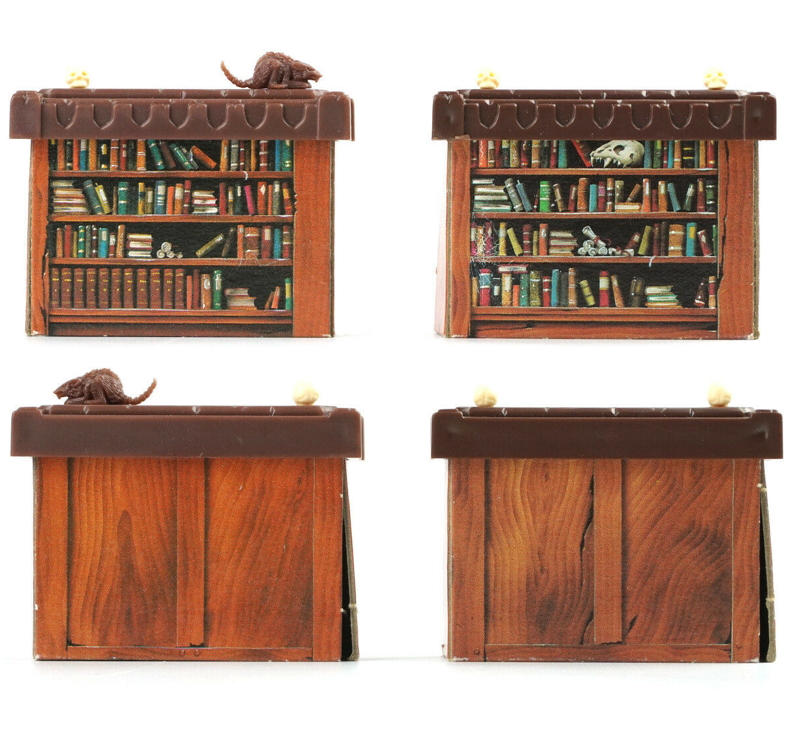
It started with the Bookcases. In creating the plastic insert for the carcase, it became readily evident that the proportions of the case were terribly off. In relation to its height, the shelves were either far too short or far too shallow, a problem that was partially solved by creating false backs for each shelf to reduce their depth. This did not, however, solve the problem of filling those shelves with interesting items. The books on the original cardboard inserts were impossibly short and thin for the three dimensional proportions. The shelves were too short for me to fit a well detailed crystal ball, a monstrous skull, or even one of the plastic rats form the game itself. Furthermore, my favorite skull from the Citadel Skulls box (the contents of which had also been used on the Torture Rack, Cabinet, and Alchemist’s Bench) was a Tyranid Genestealer skull, which bore some resemblance to a certain skull seen in a certain trophy case… So it was decided. In order to make the construction of a second Bookcase more satisfying, it would be greatly modified into a dungeon-worthy Trophy Cabinet!

The first step was to create the carcase. One common fantasy trope is the inability of evil doers to create beautiful or intricate objects themselves, forcing them to “acquire” such objects from those they terrorize. Following this line of thought, it seemed reasonable that the servants of Zargon/Morcar would repurpose a hutch or similar item of furniture in order to display their ill-gotten treasures. Having grown thoroughly sick of painting wooden furniture, this concept also permitted me to stray from natural color schemes in favor of a blue, milk-paint finish fitting of whatever unfortunate farmhouse these fiends had plundered. Of course, they would not take much effort in the upkeep of such an item, leading to much wear and degradation being evident.

Once the cabinet was constructed and painted, all that remained was to assemble a suitably impressive assortment of magical relics and spoils of conquest to populate the display. Other than the aforementioned skull, I set about choosing items that were representative of the most iconic artifacts from works of fantasy. I constructed the Necronomicon from Army of Darkness from styrene, and modified a Warhammer gauntlet to produce the Infinity Gauntlet from the Marvel Cinematic Universe. Luckily, the timing of this project also coincided with the receipt of a resin 3D printer (an Anycubic Photon Mono), allowing me to print items far more complex than I could ever manually produce. Some of these items were conveniently available from online sources (such as the Chachapoyan Fertility Idol from Raiders of the Lost Ark and the Sorting Hat from Harry Potter). Others I managed to digitally sculpt myself, including the Genie’s Lamp from Aladdin, the Ocarina of Time from The Legend of Zelda, a banner of House Frey from A Song of Ice and Fire (my surname happens to be Frey), a Palantir from The Lord of the Rings, and the jade emblem of Thulsa Doom from Conan the Barbarian. The process of translating these mental constructs into physical models through technology was very rewarding, if somewhat bittersweet given how easily it replaced the artistic skill that would have been previously required to manually sculpt such objects.

Overall, I’m very happy with how this turned out. It was a pleasure to work on the collection of trinkets, not only due to the excitement of dabbling in a new hobby with digital sculpting. With most of my projects taking long hours of work, it was quite a welcome release to have a smattering of small individual items which could be finished relatively quickly. The fact that they were also recognizable props from some of my favorite franchises didn’t hurt either! And now, at last, I am finally done with all the furniture from HeroQuest. It was rewarding, but very tedious. It won’t be long until the entire core box and first two expansions (Kellar’s Keep and Return of the Witchlord) are complete.


Wood:
Base coated with Field Blue (70.964). Lined with Dark Sea Blue (70.898). Shade with mix of two for grain and edges. Highlight with Pale Grey Blue (70.907)/Field Blue mix. Wood showing through with German Camo Black Brown, Splinter Blotches II (70.347), Dark Mud (70.316), and Medium Grey (70.987).

Fertility Idol and Genie’s Lamp:
The gold was painted using a standard non-metallic metal technique using the following colors: VMC German Camo Black Brown (70.822), VGC Heavy Brown (72.153), VGC Heavy Goldbrown (72.151), VMC Ice Yellow (70.858), VMC Ivory (70.918), and VMA Armor Brown (71.041).

Palantir:
The entire piece was base coated with VMC Black (70.950). The area that would eventually become the pupil was selected, and a pattern of flame-like tendrils were painted as though they radiated from this central point. This design was initially blocked in with VGC Bloody Red (72.010), followed by VGC Orange Fire (72.008), VMC Flat Yellow (70.953), and Schmincke Titanium White with each layer covering less and less of the flames. The pupil was then redrawn with VGC German Camo Black Brown (70.822), which was also used to touch up areas where the flames created too much coverage. Finally, some specular highlights were added to create the appearance of glass with Titanium White blended into the surrounding area with the inclusion of some German Camo Black Brown.

Necronomicon:
The entire face of the book was base coated with VGC Tan (72.066). The eyes, nostrils, and mouth were base coated with VMC German Camo Black Brown (70.822). The wrinkles in the face were then painted in with various mixes of Tan, VGC Charred Brown (72.045), VMC Desert Yellow (70.977), and VMC Ivory (70.918). The pages were then base coated with VMC Medium grey (70.987). The pages were then shaded with a coat of VGC Sepia Ink (72.091), and the cover was shaded with several coats of thin Citadel Agrax Earthshade. This process was repeated several times, with reapplication of the various paint mixes followed by washes of the Agrax Earthshade until I was satisfied with the overall look.

Infinity Gauntlet:
The gauntlet was painted with a standard non-metallic metal approach using the following colors from the Scale Color NMM Gold and Bronze set: Gobi Brown (SC12), Sahara Yellow (SC11), Tenere Yellow (SC10), and White Sands (SC09). (I was excited to try some Scale Color paints, and they were… okay. Still prefer Vallejo).

Ocarina of Time:
The flute was base coated with a 1:1 mix of VGC Night Blue (72.019) and VMC Azure (70.902). This was then blended into a layer of pure Azure, followed by a 1:1 mix of Azure and VMC Pale Blue (70.906), and finally a point highlight of the last mix and a dash of Schmincke Titanium White.

Banner of House Frey:
The background of the banner was painted with mixes of VMC Black (70.950) and VMC Pale Blue (70.906) ranging from a 1:1 mix to pure Pale Blue. The sigil and border were painted with mixes of VGC Night Blue (72.019) and Schmincke Titanium White. The gold pole was painted with VGC Heavy Goldbrown (72.151), VMA Armor Brown (71.041), and VMC Ice Yellow (70.858).

Thulsa Doom’s Medallion:
The jade medallion was base coated with VMC Uniform Green (70.922). The major forms were then lightened with progressive mixes of Uniform Green and VMC Green Sky (70.974), mixes of Green Sky and VMC Green Grey (70.971). Color variation was achieved with some glazes of VMC Ice Yellow (70.858) to areas of highlight and VMA Armor Brown (71.041) to areas of shade.

Not-Xenomorph Skull:
The entire skull was base coated with VMC Khaki (70.988). The forms of the bones were lightened with progressive mixes of Khaki and VGC Bonewhite (72.034), followed by mixes of Bonewhite and VMC Ivory (70.918). Final highlights were applied with pure Ivory.

Sorting Hat:
The entire hat was base coated with VMC Chocolate Brown (70.872). Shade was applied in deep recesses with a 1:1 mix of Chocolate Brown and VMC Black (70.950). The forms of the hat were brightened with progressive mixes of Chocolate Brown and VMC Flat Earth (70.983), followed by mixes of Flat Earth and VMC Dark Sand (70.847). Scratches and texture were added with pure Dark Sand.

Undead skin with nonspecific robes but gold horns.

Weapon Rack from Classic HeroQuest

A wise man once said, “important  things go in a case. You got a skull for your brain, a plastic sleeve for your comb, and a wallet for your money.” Well, for brave adventurers, there are few things more important than weapons, so it stands to reason that a Weapon Rack would be equally necessary. Luckily, this dungeon staple is present and accounted for in the assortment of HeroQuest furniture!

The stock Weapon Rack in all its plastic glory.

Unlike the other miniature terrain in this game, the Weapon Rack is a single piece of plastic with no cardboard inserts, making it a blessedly uncomplicated project requiring no modification or scratch building. Despite this structural simplicity, the collection of weapons on display required a fair bit of non-metallic metal work compared to the Cabinet and Bookcase

The paintwork was rather straightforward. While the Throne and Alchemist’s Bench had more finished appearances befitting actual items of furniture, I felt a natural raw lumber look would be more appropriate for the utilitarian Weapon Rack. The next major decision was whether the weapons would be rusted and abused or new and shiny. While the former would be in keeping with second hands items salvaged by Orcs, I decided that the latter would be more exciting for gameplay. Let the heroes believe that they have stumbled upon valuable equipment or even a precious Artifact, then dash their hopes as they draw a Wandering Monster card! For both variety and realism, I attempted to create different metallic finishes for the weapons. The heavy maul and axe were painted relatively dark and unreflective, giving them a sense of weight. The swords and spear received a more polished application, suggesting more care and finesse in their use. The shields posed a bit of a conundrum… It seems pretty standard for the fleur-de-lis to be painted white and blue, and the lion rampant to have the Lannister colors of gold and crimson. I decided to avoid these arguably cliched palettes and try some less common combinations.

Overall, I am very happy with the end result. The metal work is bright and flashy, especially the shields. However, if I should ever acquire a second Weapon Rack I will definitely paint it in the used and abused state. But for now, I only have one more piece of furniture to paint. And it is a doozy!!! 


Wooden Frame:
The wood of the rack itself was base coated with a 1:1 mix of VMC Chocolate Brown (70.872) and VPA Canvas (70.314). The individual lines of grain were painted with a 1:1 mix of VPA Canvas and VPA Light Mud (70.314) with just a dash of VMC Flat Earth (70.983). Highlights were applied to edges and upraised portions with pure Light Mud.

Steel:
The various steel portions were all painted with a standard non-metallic metal approach using the following colors: VMC Black (70.950), VMC Dark Sea Blue (70.898), and VMC Ivory (70.918). The differences in shade were accomplished by using predominantly lighter or darker tones on individual weapons.

Gold:
A standard non-metallic metal approach was used with the following colors: VMC German Camo Black Brown (70.822), VGC Heavy Brown (72.153), VGC Heavy Goldbrown (72.151), and VMC Ivory (70.918).

Leather Wraps:
Several different recipes were used with a simple three tone progression from shadow, to base, to highlight.
The darkest wraps started with a 1:1 mix of VMC Black (70.950) and VMC German Camo Black Brown (70.822), followed by pure German Camo Black Brown, and finally a 1:1 mix of German Camo Black Brown and VMC Medium Grey (70.987).
The reddish leather sword grip started with a 1:1 mix of German Camo Black Brown and VMC Red Leather (70.818), followed by pure Red Leather, and finally a 1:1 mix of Red Leather and VMC Dark Sand (70.847).
The red wraps of the mace started with a 1:1 mix of German Camo Black Brown and VMC Cavalry Brown (70.982), followed by a 1:2 mix of the same, and finally pure Cavalry Brown.

Wooden Handles/Shields:
The wooden handles and backs of the shields were blocked in with VMC German Camo Black Brown (70.822). This was almost completely covered with a coat of VMC Chocolate Brown (70.872). Individual grains were picked out with VMC Flat Earth (70.983), and highlighted with a 1:1 mix of Flat Earth and VMC Dark Sand (70.847).

Green Shield:
The base tone for the green shield was VMC Flat Green (70.968). A shade tone was created with a 1:1:2 mix of VMC Black (70.950), VGC Night Blue (72.019), and Flat Green. Highlights were added in two stages: first with a 1:1 mix of Flat Green and VGC Escorpena Green (72.032), and lastly with the inclusion of an equal measure of VMC Ivory (70.918) to the previous mix.

Sorcerer’s Table from Classic HeroQuest

Every Torturer needs his Rack, every Alchemist needs his bench, and every Sorcerer needs their… okay, I can’t call this thing a table. It’s an altar, okay? The Sorcerer’s ALTAR!!! I can only assume that the avoidance of that word was related to the “Satanic” allegations that plagued Dungeons and Dragons, but let’s call a spade a spade. An ornate surface with a giant book and candlesticks? That’s an altar!

Just like the other HeroQuest furniture, the Sorcerer’s Altar is composed of a plastic top with a printed cardboard insert for the sides. Although the top appears to be some type of solid block, the original insert depicted a wooden carcass with drawers and an engraved back, identical to the Alchemist’s Bench without legs. Dissatisfied with this appearance, I chose a different design for my scratch-built styrene replacement. In order to represent a more classic altar, the different faces were embellished with recessed panels, round pillars, and arcane symbols (two are “Chaos” emblems from Warhammer, and the third is a rune from Legend of Zelda).

Unfortunately, one of my candlesticks was also broken. This required sculpting a new flame and replacing a portion with stock round styrene. Not perfect, but I imagine it would be pretty difficult to tell which was original and which was repaired without a direct comparison to stock pieces.

Painting was relatively straightforward. The majority of the stone was painted to be a very dark marble. The intention for the columns and butterfly-shaped tiered surface was to emulate a more reflective stone, like onyx or obsidian. The candlesticks and symbols were painted with a standard non-metallic metal approach.

Finally, the blank page of the book granted some additional area for originality. I chose to design an arcane design with surrounding notes. The “black shield” in the center (the combat dice symbol that blocks damage when monsters are defending) suggests that the Sorcerer was attempting to cast a defensive spell on his minions, hopefully improving the odds of successful rolls for the Zargon/Morcar player!

The top of the Sorcerer’s Table/Altar, showing the defensive spell being cast by the Sorcerer.

Overall, this turned out nicely. I ran into some trouble with my matte varnish, yet again, dulling contrast and creating a dusty appearance over the entire miniature. Luckily, I found that I was able to rub off the first coat of varnish using a wet brush and a lot of patience. The second layer went down better, but the colors are still not as vibrant as before, especially the marble. Excuses, excuses…
We are nearing completion of the HeroQuest core box, with only three more pieces to go. Stay tuned!


Obsidian:
The pillars and “butterfly shapes” on the top were painted using VMC Black (70.950) and Schmincke Titanium White similar to a nonmetallic metal approach only limiting the intensity of the highlights.

Book:
The cover of the book was base coated with a 1:1 mix of VMC Black (70.950) and VMC Cavalry Brown (70.982), then edge highlighted with pure Cavalry Brown.
The gold corners were painted with a standard nonmetallic metal approach using VMC German Camo Black Brown (70.822), VGC Heavy Brown (72.153), VGC Heavy Goldbrown (72.151), and VMC Ivory (70.918).
The pages were base coated with a 1:1 mix of VMC German Camo Black Brown and VMC Medium Grey (70.987). The individual pages were then picked out with Medium Grey, and highlights were applied with a 1:1 mix of Medium Grey and VMC Deck Tan (70.986) followed by pure Deck Tan for point highlights.
The ribbon was base coated with VGC Sombre Grey (72.048). Some shade was added with a 1:1:1 mix of VMC Black, Sombre Grey, and VGC Night Blue (72.019). A 1:1 mix of Sombre Grey and VGC Steel Grey (72.102) was applied to the raised areas. This was mixed with an equal measure of VGC Wolf Grey (72.047), followed by pure Wolf Grey.

Black Marble:
The areas of black marble were base coated with VMC Black Grey (70.862). Thin lines of a 1:1 mix of Black Grey and VMC Green Grey (70.971) were painted in irregular, somewhat random directions to make the first layer of veining. Existing veins were accentuated and new veins were added with a 1:2 mix of the same colors. Some color variation was added to the dark areas with a 1:1 mix of Black Grey and VMC Black (70.950). Finally, small accents of pure Green Grey were sparingly added to sections of veining.

Candlesticks:
A nonmetallic metal approach was applied to the candlesticks using the following colors: VGC Heavy Brown (72.153), VGC Heavy Goldbrown (72.151), and Schmincke Titanium White. Some VGA Armor Brown (71.041 ) was added to some of the deepest shadows.

Candles:
The entire candle was painted with VMC Sunny Skin Tone (70.845). This was left in the deepest recesses, while the majority of the surface was covered with a base coat of VMC Beige (79.917). Highlights were applied with a 1:1 mix of Beige and VMC Ivory (70.918), followed by point highlights with pure Ivory. 

Alchemist’s Bench from Classic HeroQuest

Allow me to set the scene. Your party has been tasked with eliminating the Orc threat stemming from a local dungeon. In besting a dozen of the brutes, your party has taken some damage and the wizard has expended both of his healing spells. You open a door (or rather Zargon opens a door at your request) to find a small chamber, empty save for a cluttered desk sitting against the far wall. Upon this mysterious desk you find a flask of liquid. What else WOULD you do but instantly quaff this unknown liquid? (The European version at least specifies that you recognize the liquid, but Americans were just going around drinking everything!)

Of all the pieces of furniture found in the dungeons of HeroQuest, the Alchemist’s Bench has to be the most exciting one to stumble across. While everyone loves the ambiance of the Torture Rack, it doesn’t do anything other than block your path. Sure, a Treasure Chest may hold a horde of gold or a powerful artifact, but just as often they contain a poison needle or are positioned behind a pit trap. Rarely is the Alchemist’s Bench trapped, and often it holds a gem in one of its drawers or a potion in one of its bottles.

Stock image of the Alchemist’s Bench as it appears in the original game. (The top of the balance is missing…)

As with the Cabinet and the Tomb, the first step in upgrading the Alchemist’s Bench was to replace the original cardboard insert with a scratchbuilt plastic component. This was rather straightforward except for the decorative runes cut into the back, which required some fiddly spacing and piecing together of small bits. In place of the stock skull (which is awfully chunky and lacking in detail), I selected a suitable replacement from the Citadel Skulls Box previously referenced. The human skulls were a bit on the small side, and I had used an Orc skull for the Torture Rack previously, so I chose a bird skull for this piece. Alchemists must be well educated, and it seems bird skulls are often used as set decoration in the chambers of wizards and scholars.

Painting was also straightforward, if slightly mind-numbing. Having done woodgrain and non-metallic metal on so many subjects before, those portions were completed without much excitement. Glass, on the other hand, was a new undertaking for me. How does one paint a solid object to appear as though it were clear? After scouring online tutorials and reference photos, I gave it a try… and failed to achieve convincing transparency. Luckily, many old bottles appear frosted or barely translucent, so they still work decently well for a Fantasy piece. But this is definitely an area in which improvement can be made.

One more piece of furniture complete, one step closer to finishing the core box of HeroQuest. Next I have set my eyes on the Sorcerer’s Table… which means marble. Lots and lots of marble. If I make it through that ordeal, then all that is left is the Gargoyle and the second bookcase (which will be reimagined in a special way). Stay tuned!


Stained Wood:
The areas of stained wood were base coated with VMC Mahogany Brown (70.846), which also served as the majority of darker grain lines. A layer of a 1:1 mix of Mahogany Brown and VMC Orange Brown (70.981) was applied for the major striations, followed by a thinner line of pure Orange Brown as a highlight along the top of each major striation. Grain lines were darkened in areas with a 2:1 mix of Mahogany Brown and VMC Black (70.950), and the highlight was lightened in some areas with the addition of VMC Dark Sand (70.847) to the Orange Brown.

Natural Wood:
The unstained wood for the sides of the open drawer were base coated with a 1:1 mix of VMC Orange Brown (70.981) and VMC Dark Sand (70.847). The major striations of the grain were then painted with pure Dark Sand. Highlights along the corners were applied with the addition of some VMC Ivory (70.918) to the Dark Sand.

Leather Blotter:
The leather desk pad was base coated with VMC Flat Brown (70.984). The borders were then darkened with a wash of Flat Brown mixed with VMC Black (70.950). Lighter areas were applied with the addition of some VGC Parasite Brown (72.042) to the Flat Brown, and even lighter with a splash of VGC Bonewhite (72.024) added to the mix in fine, linear streaks. The different colors were then muted with glazes of the original Flat Brown.

Earthenware Jar:
A base coat of VMC Cork Brown (70.843) was applied to the entire jar. A shade tone was created with the addition of some VMC Flat Brown (70.984), which was applied under the lip of the jar, along the inside surfaces, and stippled around the outside. A highlight tone was applied with a 1:1 mix of Cork Brown and VMC Ivory (70.918). Areas with too much contrast were blended back down with glazes of Cork Brown.
The liquid in the jar was base coated with VMC Park Green Flat (70.969), lightened with VGC Escorpena Green (72.032), and then stippled with Escorpena Green mixed 1:1 with VMC Deck Tan (70.986).

Bottles:
The brown bottle was coated with VMA Dark Brown (71.042). A 1:1 mix was made with Dark Brown and VGC Beasty Brown (72.043), which was applied from the bottom quarter (the waterline) to the top quarter, blending softly into the Dark Brown at the top. The same process was repeated with pure Beauty Brown, starting at the waterline and blending into the previous layer about halfway up the bottle. A thin line of Beasty Brown mixed 1:1 with VGC Scrofulous Brown was added in the lightest areas directly above the waterline. The original Dark Brown/Beasty Brown mix was also applied below the waterline to create a sense of translucency to the liquid. Reflective highlights were added first with a 2:1 mix of Dark Brown and VMC Ivory (70.918), followed by specular highlights with a 1:2 mix of the same colors.

A similar process was followed with the green bottle using VMC Black (70.950), VMC Ivory (70.918), and VGC Goblin Green (72.030).

The small ceramic jar was base coated with VMC Medium Grey (70.987), shaded with the addition of some VMC German Camo Black Brown (70.822), and highlighted with the addition of some VMC Ivory (70.918). The lid was then base coated with VMC Flat Brown (70.984), shaded with the addition of German Camo Black Brown, and highlighted with the addition of Medium Grey.

Bone:
The bone areas we’re base coated with VMC Khaki (70.988). Shaded areas were darkened with the addition of VMC German Camo Black Brown (70.822). Layers were added with a 1:1 mix of Khaki and VGC Bonewhite (72.034), followed by pure Bonewhite. Highlights were applied with a 1:1 mix of Bonewhite and VMC Ivory(70.918), and final point highlights with pure Ivory.

Gold:
A standard non-metallic metal approach was used with the following colors: VMC German Camo Black Brown (70.822), VGC Heavy Brown (72.153), VGC Heavy Goldbrown (72.151), and VMC Ivory (70.918).

The Tomb from Classic HeroQuest

There is no question that The Lord of the Rings is among the most influential literary works of all time, being the foundation upon which nearly all modern Fantasy has been built. There is also no question that one of the most memorable sections of the book is the Fellowship’s journey through the deserted, subterranean city of Moria. The atmosphere of Moria is palpable: miles of pitch-black passages buried deep beneath a mountain, echoing silence that serves as a constant reminder of the conspicuously absent Dwarven inhabitants, and the dreadful mystery of what hidden menace led to their downfall. The sequence culminates in the discovery of Balin’s Tomb and the Book of Mazarbul, which details the final days of the Dwarves occupation of the hall. What follows is surely the most exciting confrontation in all of Tolkien’s works: the initial conflict with the orcs and their cave-troll, the introduction of the Balrog, the flight to Khazad-dum, and the resulting loss of the Fellowship. But at the center of it all is the Tomb, a monument to a dead king forever lost within the mountain. It serves as a clear example of the potential doom that awaits those who adventure too far into the dark.

For this reason, the Tomb was the piece of furniture to which I looked forward to updating the most. Like the Bookcase and the Cabinet, the Tomb comes as a plastic top with a foldable cardboard insert for the sides. The first step in “improving” the piece was to replace the cardboard with scratchbuilt plastic components. This was accomplished with the use of sheet styrene, first creating a box upon which the original plastic top would seat, and then laminating details (such as the swords and nameplate) onto the sides.

The painting part of this project was a long slog. One of the major flaws of my painting style is that I have great difficulty producing random texture, such as woodgrain and stone. This meant that I spent hours placing cracks, chips, and color variation by hand… which got old very quickly. The nonmetallic portions of the gilded statue went much faster. I am especially proud of the decorative swords, as the blades are entirely flat with the fullers and bevels being optical illusions created by highlight and shadow.

Overall, I am very happy with how this piece turned out. I think the stone texture added a lot of visual interest and the non-metallic work is some of the best I have been able to accomplish. Next, it’s time to revisit that woodgrain that has given me so much trouble. Until then…


Stone:

A base coat was applied to the entire surface with a 1:1 mix of VMC Grey Green (70.866) and VGC Stonewall Grey (72.049). Next, thin layers were painted somewhat randomly with a mix of Stonewall Grey, Grey Green, VMC German Camo Beige WWII (70.821), and VMC German Camo Black Brown. The ratios of these colors were adjusted from layer to layer, but the mix was close to 2:1:2:1 of the colors respectively. Chips and cracks were highlighted with VMC Deck Tan (70.986).

Some color variation was introduced with the addition of VMC German Camo Pale Brown (70.825) and VMC U.S. Dark Green (70.893).

Black Metal:

A standard non-metallic metal approach was utilized with the following colors: VMC Black (70.950), VMC Black Grey (70.862), and VMC Ivory (70.918).

Steel:

A standard non-metallic metal approach was utilized with the following colors: VMC Black (70.950), VGC Cold Grey (72.050), and Schmincke Titanium White.

Fireplace from Classic HeroQuest

It is cold deep beneath the earth. Where the light of the sun does not shine, warmth must be found in other ways. It should come as no surprise, then, that even the denizens of Zargon’s foul dungeons appreciate the comfort provided by a cozy Fireplace. And it just so happens that this is the next piece of furniture to be upgraded for my HeroQuest set.

As with the other HeroQuest furniture, the stock version of the Fireplace comes as a plastic hearth with a folded cardboard insert. Following my normal approach, the original plastic was not modified at all, but the cardboard insert was replaced with a scratch-built model made from white styrene sheet (as seen above). The construction was rather straightforward, starting with the angled core and building up layers in rough chunks to create the overall shapes. The surface detail was then laminated over this scaffold, with individual bricks and pieces of the mantle. The small chest, dagger, and picture frame were made in the same fashion, but the candlestick was sculpted from different diameters of styrene rod shaped with a drill press. A small hole was drilled in the top of the candle, and a bit of a staple was used for the wick.

Painting was also pretty straightforward, albeit time-consuming. There are a LOT of bricks in this piece, and the surface detail was all painted-on rather than sculpted. I chose to avoid actual flames, since I could not sculpt those without modifying the original plastic. Instead, I attempted to create the appearance of a low-burning fire, with ashen logs and glowing embers. I think the effect came off rather nicely. In order to make the candle look more realistic, I used thickened paint to buildup various blobs and drips meant to represent melted wax.

The portrait did not make much sense to me. Why would the minions of Chaos want to look at some old human king? I decided that I would add a bit of culture to the scene, as you can see below.

Overall, I’m happy with the end result. The embers look pretty neat, the candle looks realistic, the non-metallics look shiny, and the bricks… are done! Only a few more items left, so stay tuned for more…


Bricks:

The stonework was first blocked in with VMC Olive Drab (70.889), primarily to darken the spaces between the stones. In some of the recesses, this was darkened further with the addition of some black to the Olive Drab. The surfaces of the individual stones were then base coated with VMC German Camo Beige Brown (70.821). Areas of shadow and highlight were applied to create rocky features using  German Camo Beige Brown mixed progressively with either Olive Drab for shade or VMC Ivory (70.918) for highlights.

Logs/Embers:

The fire area was initially coated with a layer of Schmincke Titanium White. This was then covered with a layer of VMC Flat Yellow (70.953), followed by a layer of VGC Orange Fire (72.008). This was left in the deepest nooks and crannies, while the edges of the logs and cinders were built up with glazes of VMC Flat Red (70.957). The individual logs and cinders were then blocked in with VMC German Camo Black Brown (70.822). The borders between the logs and embers was then blended with a 1:1 mix of German Camo Black Brown and Flat Red.

The logs were next lightened with a 1:1 mix of German Camo Black Brown and VMC Deck Tan (70.986), leaving the German Camo Black Brown in the “cracks” between strips of bark and along the edges between different logs. These light areas were brightened further with a 1:2 mix of the same colors, followed by highlights of pure Deck Tan.

Hearth Stones:

The stones were base coated with a 3:1:1 mix of VMC Neutral Grey (70.992), VMC Black (70.950), and VMC Dark Sea Blue (70.898). This was darkened around the edges and shadow areas with the addition of VMC German Camo Black Brown (70.822) and occasionally a splash of VMC Flat Red (70.957) to act as reflected light from the embers. The stones were highlighted with the incremental addition of VMC Deck Tan (70.986).

Candle:

The entire candle was painted with VMC Sunny Skin Tone (70.845). This was left in the deepest recesses, while the majority of the surface was covered with a base coat of VMC Beige (79.917). Highlights were applied with a 1:1 mix of Beige and VMC Ivory (70.918), followed by point highlights with pure Ivory. The wick was painted with VMC German Camo Black Brown (70.822).

Metals:

The gold was applied using a standard non-metallic metal approach using the following colors: VGC Heavy Brown (72.153), VGC Heavy Goldbrown (72.151), VMC Ivory (70.918), and VMA Armor Brown (71.041).
The steel was applied using a standard non-metallic metal approach using the following colors: VMC Black (70.950), VMC Dark Sea Blue (70.898), and VMC Ivory (70.918).

The Throne from Classic HeroQuest

Literature is replete with inspiring men performing inspiring acts from inspiring places. Indiana Jones silhouetted against the setting sun as his men unearth the Well of Souls, the Rocketeer standing beside the American Flag before flying after the escaping Zeppelin, Robin Hood standing in the middle of the Sheriff’s courtyard as a cart explodes behind him, Zorro posing atop the city wall after having freed some prisoners… With those scenes in mind, where do you think the diabolical Witch Lord sat while giving orders to his evil minions? Why, it was on… A CHAIR!!!HeroQuest Throne Chair Furniture Replacement Minis Hero Quest DND D&D Terrain

As with the previously modified pieces of furniture, the Throne is assembled from several plastic parts that frame a cardboard insert. As before, sheet styrene was used to sculpt/construct a three-dimensional replacement for the cardboard insert. However, further efforts were required to deal with the exposed spacing strut visible at what would be the headrest (as seen above). This was accomplished by making a rectangular “tube” through which the strut could pass, and upon which additional details could be placed without affecting the original components. (My ongoing intention is to leave the stock plastic parts completely unchanged) I used one of my spare plastic skulls to add some flair to the otherwise bland model.

And that’s pretty much it for this one! Wood textures, some non-metallic metal, and some simple construction. Not much else to say, but rest assured, there will be more to discuss with the next model… the Fireplace!


Wood:

Base coated with VGC Charred Brown (72.045). Shade with 1:1 mix of Charred Brown and VMC Black (70.950). Highlights were added with a 1:1 mix of Charred Brown and VMC Mahogany Brown (70.846). Final highlights were added with pure Mahogany Brown.

Cushion:

The cushion was based with VMC Black Red (70.859). A layer of VMC Dark Red (70.946) was applied along the major folds, and was then blended back into the shadows with a 1:1 mix of Black Red and Dark Red. Highlights were applied with a 2:1 mix of Dark Red and VMC Ivory (70.918), and then blended back down with Dark Red. (Stippling was applied to each area with a color one step brighter than the underlying tone, then blended back slightly with glazes of the original color.)

Gold:

A standard non-metallic metal approach was applied using the following colors: VMA Armor Brown(71.041), VGC Heavy Brown (72.153), VGC Heavy Goldbrown (72.151), and VMC Ivory (70.918).

Treasure Chests from Classic HeroQuest

There is nothing more exciting than opening a door and seeing a treasure chest on the other side of the room. The lure is almost irresistible, and one can learn a lot about their playmates by how they react to this sight. Is the Wizard a loot monger, hiding in the back row while the monsters guarding the chest are dispatched, only to swoop in and steal the treasure once the foes have been defeated? Is the Barbarian so dimwitted and impatient that he rushes forward without searching for traps, only to fall into a pit trap placed directly in front of the treasure? Is the Dwarf so completely incompetent that he fails to disarm the poison needle trap while opening the chest (disarming traps being the ONE area in which dwarves excel)?

There are three Treasure Chest miniatures included in the HeroQuest core game. Like the other items of furniture, the chests are constructed from plastic end pieces which support a folded cardboard insert representing the middle of the chest. As with the Bookcase and Torture Rack, I replaced the cardboard insert with a plastic component scratchbuilt from styrene sheet. Below is a picture of the primed components prior to painting (it is purposefully dark because the bare primer doesn’t show much detail when well-lit).


The concept behind the paint scheme was pretty simple. In addition to boardgames, I have a great affinity for classic video games, such as the Final Fantasy and Legend of Zelda series. Those games were rife with treasure chests, most of which were made of simple wood and steel. But the chests that contained important items were often more elaborate, painted bright colors and bound in gold rather than steel (as seen below.)

To that end, I chose two paint schemes for the different chests in order to give the dungeon master some flexibility in setting up the scenario. Is it a mundane chest containing a few gems or a bit of gold? Or is it a fancy chest holding a key item or a powerful relic? I should think it would be obvious which is which…

Overall, I’m pretty satisfied with the results. The metal work on the regular chests reads well enough without being too fancy, and the “special” chest looks almost cartoonishly extravagant yet doesn’t quite cross over the line of absurdity. These miniatures are perfect illustrations of why I tend to prefer non-metallic techniques to the use of true metallic paints. Usually, I think true metallics look out of scale on a miniature, since the small metallic flakes in the paint tend to create a glittery effect rather than a smooth shine like real metal. That would not be as much of an issue on this subject, given the relatively large size of the chests. But the bold, stylized look that can be achieved with the manual placement of highlights and blends allows for a much more interesting (and definitely more challenging) end result. That’s just my opinion, but I cannot seem to get enough of that 1980’s “Heavy Metal” look!

By my count, that leaves me nearly half-way done with the furniture. Soon I’ll be able to get back to the few remaining base-set figures before tackling some expansion material. Until next time!


Brown Wood:

The entire model was base coated with VMC Black (70.950). The lowest planks were then coated with a 1:1 mix of VMC Chocolate Brown (70.872) and Flat Earth (70.983). Dark grain lines were then painted with a 1:1 mix of Chocolate Brown and Black, followed by light grain lines with a 3:1 mix of Flat Earth and VMC Dark Sand (70.847). The top-most planks were painted in the same fashion, but each color was made one step lighter than those on the lower planks. For instance, the planks were based with pure Flat Earth, and the highlights were a 1:1 mix of Flat Earth and Pale Sand.

Steel:

A standard non-metallic metal technique was applied with the following colors: VMC Black (70.950), VGC Cold Grey (), and Schmincke Titanium White.

Red Wood:

The entire model was base coated with VMC Black (70.950). The lower planks were base coated with VMC Cavalry Brown (70.982). Dark grain lines were added with a 1:1 mix of Cavalry Brown and Black, followed by light grain lines with VMC Amaranth Red (70.829).

Gold:

A standard non-metallic metal technique was applied with the following colors: VGC Heavy Brown (), VGC Heavy Goldbrown (), VMC Ivory (70.981), and VMA Armor Brown ().


Cabinet from Classic HeroQuest

Imagine the struggling victims whose limbs were pulled from their sockets atop the Torture Rack. Imagine the evil knowledge and arcane secrets contained within the volumes and scrolls that grace the Bookcase. Imagine the ill-fitting pantaloons and paisley printed cravats preserved inside the Cupboard!!!

The Cupboard shares many features with the Bookcase, including a single cardboard component of identical dimensions, the same plastic top, and the same selection of decorative features to adorn said top (a skull and a rat). Construction of the plastic replacement for the cardboard was relatively straight forward. A basic box-shaped core was created from four sheets of styrene. These were cut to the same size as the cardboard sheet in order to fit into the same slots on the underside of the lid. Each side was then laminated with multiple layers of styrene to thicken the dimensions of the cabinet and add detail. For instance, the doors were made from separate sheets of styrene, cut to shape and glued to the front panel. The surrounding frame work was then built up around the doors to appear flush, before the hinges and handles were added.

As with the Bookcase, I chose to create some variety with the decorative features for the top. I decided to keep the second rat, given that it was at least in a different pose than the one I had used for the Bookcase. In place of the disappointing stock skull, I constructed a large book with a ribbon. The original cardboard design featured a beast skull on the central arch between the two sets of doors. This was replicated with a piece from the amazing Citadel Skulls box I had mentioned in my previous post on the Torture Rack.

The painting was rather straightforward, albeit time consuming. The wood was painted in the same manner as the bookcase, only using lighter colors to simulate oak. The hinges and handles were painted as wrought iron. The book and rat were welcome splashes of color in the otherwise monotonous process.

And that completes another piece of furniture! Next are the three treasure chests, which will put my patience with non-metallic metals to the test. Slowly chipping away at the components of this amazing game, but still no light at the end of the tunnel. Until next time…


Wood:

Base coated with VMC (Panzer Aces) New Wood (70.311). Dark grain lines were added with VMC Flat Earth (70.983). Highlights along the grain were painted with a 2:1 mix of VMC Desert Yellow (70.977) and the New Wood. Point highlights were added with pure Desert Yellow. Knotholes and cracks were darkened with VMC Chocolate Brown (70.872). Edges of panels were separated and shaded with glazes of VMC Smoke (70.939).

Black Metal:

The metal elements were based with VMC Black (70.950). A non-metallic metal gradient was established with the application of VMC Black Grey (70.862), initially pure, followed by progressive mixes with Schmincke Titanium White. The point highlights were an approximately 1:2 mix of these colors.

Book:
The covers of the book were base coated with VMC Periscopes (70.309). A lighter tone was created with a 1:1 mix of Periscopes and VMC Pale Blue (70.906). This was used to stipple the surface as well as to edge highlight the covers. The areas were then glazed with several thin layers of Periscopes to reduce the brightness of the pattern, followed by a repeat application of the edge highlighting.

The golden corner pieces were painted with a standard non-metallic metal application of VMC German Camo Black Brown (70.822), VGC Heavy Brown (72.153), VGC Heavy Gold Brown (72.151), and VMC Ivory (70.918).

The pages were base coated with VMC Medium Grey (70.987), and then washed with VGC Sepia Ink (72.091). Small highlights and streaks were then added with a reapplication of the pure Medium Grey.

The ribbon was base coated with VMC Black Red (70.859). Layers were applied with a 1:1 mix of Black Red and VMC Flat Red (70.957), followed by pure Flat Red. These areas were toned down with a glaze of Black Red, followed by edge highlighting with a 1:1:1 mix of Black Red, VMC Scarlet (70.817), and VMC Ivory (70.918).

Rat:

The rat’s fur was base coated with VMC Black (70.950). Individual tufts of fur were then picked out with VMC Black Grey (70.862), followed by highlights with the inclusion of some Schmincke Titanium White. The skin was base coated with VGC Heavy Skintone (72.140). This was mixed 1:1 with VGC Pale Flesh (72.003), followed by pure Pale Flesh for highlights. Final point highlights were applied with a 1:1 mix of Pale Flesh and VMC Ivory (70.918).

Bookcase from Classic HeroQuest

As previously discussed, the base set for HeroQuest includes several pieces of furniture that are used to create obstacles and ambiance throughout the dungeons. My efforts to modify the furniture involve keeping the original plastic elements, but replacing the cardboard inserts with sculpted styrene components. The next piece to receive this treatment was the Bookcase.

The game actually includes two versions of the Bookcase, easily distinguished by the presence of a large skull on the top shelf of one… and its absence on the other. The rest of the shelves are filled with books of random colors in random positions. Overall, the design is not incredibly interesting, in my opinion. I decided to try to recreate one bookshelf relatively faithfully, but developed a plan to have a little bit more fun with the second.

Original Bookcases
The original Bookcases, with brown plastic tops, cardboard inserts, and “toppers” (skulls and rat).

The only plastic component of the original Bookcase was the large brown top seen in the previous picture. This meant that the rest of the carcass would have to be made from styrene, which was relatively easy. The only problem I encountered was that the case was far too deep in comparison to the height of the shelves. To solve this, I created false backs for each shelf, reducing the shelf depth by about a third.

The second order of business was creating items to populate the empty shelves. The construction of these items was not particularly difficult, as I will explain shortly, but I struggled a bit in arranging the various objects in a way that was both interesting and balanced. Too many books here, which shelf should contain the scrolls, which direction should the books be tilted, etc. In the end, I used the original cardboard art for inspiration, but mixed things up a bit to fit my taste.

The books were made by cutting strips of 0.010″ styrene for the pages, which were then sandwiched between two strips of 0.030″ styrene cut slightly larger for the covers. One side of this construct was then sanded flat, and a strip of the 0.030″ was cut to size and glued on as the spine. Different styles of spine were created with the addition of strips of 0.010″ styrene in various patterns. By altering the number of pages and the sizes of the covers, I got quite a variety of heights, widths, and spine styles.

The scrolls were made with a short section of styrene rod, a wide strip of 0.010″ styrene sheet for the parchment, and a narrow strip of 0.010″ sheet for the ribbon. One end of the parchment was glued to the styrene rod and allowed to fully set. Because styrene cement actually melts the plastic, my first several attempts at wrapping the parchment around the rod resulted in the weakened plastic sheet breaking instead of bending. To remedy this, I first wrapped the sheet around a ballpoint pen, then a wooden dowel with a thinner diameter, and finally the styrene rod. This created a natural curve in the sheet, making it less brittle once the glue was applied. As I slowly wrapped the parchment around the rod, I cut little nicks and chips into the side of the strip. When I got to a diameter that I liked, I glued the ribbon along the center of one layer of the parchment, and looped it around the outer layer.

After quite a bit of painting and gluing, the books and papers were all in their proper places, and the shelves were fully stocked.

Several of the pieces of furniture in the game have mounting points for smaller plastic accessories. For the Bookcases and Cabinet (which shares the same top piece), the options include two different sculpted rats and a handful of small, poorly sculpted skulls. It seemed a shame to have the same “toppers” on all three pieces, so I decided to mix things up a bit here, as well. For this Bookcase, I chose one of the rats, and created another variant on the scrolls for variety.

That’s all for this piece of furniture. Next up will be the Cabinet, followed by my replacement for the second Bookcase. More than a few surprises in store for that one!


Wooden Carcass:

The shelves were based with a 1:1 mix of VMC Chocolate Brown (70.872) and VMC Flat Earth (70.983). The first layer of wood grain was then painted with pure Flat Earth, followed by a line of highlight along the grain with a 1:1 mix of Flat Earth and VMC Dark Sand (70.847).

Books:

There were several different colors used on the books.

The darker red-brown ones were based with VMC Mahogany Brown (70.846), which was highlighted with the inclusion of a bit of VMC Beige (70.917) and shaded by adding a small amount of VMC Black Grey (70.862).

The lighter red-brown ones were based with VMC Red Leather (70.818) and highlighted by adding a bit of Beige.

The blue books were based with VMC Dark Sea Blue (70.898) and highlighted with the inclusion of a bit of VMC Green Grey(70.971).

The green books were base coated with VMC Gunship Green (70.895) and highlighted with the inclusion of a small amount of Green Grey.

The yellow books were base coated with a 1:1 mix of VGC Heavy Goldbrown (72.151) and VMC Green Brown (70.869). This was highlighted with the addition of VMC Green Grey (70.971), and shaded with VMC German Camo Black Brown (70.822), which was also used for the dark bands and markings..

The pages were base coated with a 1:1 mix of VMC Green Brown (70.869) and VMC Green Grey (70.971). This was then washed with VMC Smoke (70.939) to create separation between the pages and tint the paper a bit.

Gold trim on the edges was done with VMC Japanese Uniform WWII (70.923).


Rat:

Fur:

Base coated with VMC Black Grey (70.862). A layer of VMC French Mirage Blue (70.900) was applied over all the furred areas, leaving the Black Grey in the deepest recesses. This was blended down into the shadows with a 1:1 mix of the French Mirage Blue and the Black Grey, and highlights were placed with the addition of VMC Deck Tan (70.986) in progressive amounts. Point highlights with pure Deck Tan were added around the face, knees, and shoulders.

Skin:

A base coat of a 1:1 mix of VMC German Camo Black Brown (70.822) and VGC Rosy Flesh (72.100). This served as the deepest shadow. A base tone was created with VGC Heavy Skintone (72.140) and Rosy Flesh. This was blended down to the shadow tone, then highlighted with a layer of the base tone mixed 1:1 with VGC Pale Flesh (72.003). Some color was glazed onto the transitions with VGC Parasite Brown (72.042). Some very selective point highlights were added with pure Pale Flesh, and then blended down with a glaze of the highlight mix.


Scrolls:

The scrolls were base coated with VMC Medium Grey (70.987). This was mixed with a bit of VMC German Camo Black Brown (70.822) for shade tones, and lightened with an equal measure of VMC Green Grey (70.971). Text was added with German Camo Black Brown lightened slightly with the Medium Grey, as well as VMC Cavalry Brown (70.982) darkened with a bit of the German Camo Black Brown.

HeroQuest Box Art